The Five Web Design Tips and Tricks
There are honestly hundreds if not thousands of tips and tricks to build your website. Most of them work. Some work better than others. Some don’t even work at all. Instead of you scouring the vast lengths of the Internet for pointers, we’ve decided to compile them into a short list. Here is a list of the Top Five Website Design Tips and Tricks.

1: Use Colors
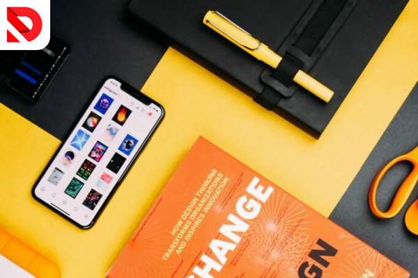
One important tip or trick to use when designing your website is utilizing a good selection of colors. Colors play an important role when it comes to website design. Using too many colors can often cast your website to be viewed as “shabby” or unappealing. Utilize colors that compliment each other for the best results, or make a single color the primary theme with different shades. You can use monochrome palettes to get a sleek high tech design or you can settle with a simple white or black look. This website provides you with colors that work beautifully together. But remember, the choice itself is yours for the making.
2: Keep Contrast In Mind
Similar to color selection, Contrast is an essential tip or trick to keep in mind when creating a visually appealing website. Contrast itself plays many values when it comes to making your web design look attractive. Say you have a full black background with a dark gray text. It would definitely be a pain to try to read it because your eyes can barely distinguish between the two shades. Instead, use two contrasted colors such as Dark Gray and Light Gray or Black and White. In general, use a combination of colors that are easy for the eye to differentiate between the two. This makes the website itself look more endearing and professionally made.
3: No Info Dumping
Don’t ever display too much information on one site. It makes reading the website itself difficult and unenjoyable. Contrary to popular opinion, you shouldn’t try to fill the void, you should try to create it. Having more “white space” as some may call it, appeals to the human mind. Use hyperlinks and smaller text to create a nice roomy and airy feel to the design itself. Info Dumping is when you add in too much information into one space. Avoid that at all costs. Use our own website as a reference.
4: Animations (a very important trick)
Animations themselves prove crucial to a website. They allow for a smooth technical feel to every move you make. Whether it be a small animation or a fancy long one, they all work amazingly well for making your web designs feel modern and chronically updated. Animations have been proved to be gentle on the eyes and that would add into the attractiveness of your website, thus making it more eye catching to visitors. Don’t go overboard with animations though, because that would honestly just wreck the design. Settle for a cursor tracker, or maybe text that rises upwards. Feel free to take inspiration from our website once again as a reference.
5: Art
Art. Aesthetics. Art. What do they have in common other than starting with the letter A? They need each other. To have a good aesthetic, you need to have good art. Feel free to utilize a moving one such as the ones in the Experience and Portfolio menus in our website. Art builds into your aesthetics and by simply having a little bit of a splash of color, you would improve your website’s general look. Good aesthetics guarantee that people will be intrigued to stay on your website. Animated Art works wonders to your design as well. Add whatever you want, really, but be sure to do so with a light hand.
That sums up our five tips and tricks to have a good website design by DevByDany, if you have any questions, feel free to email us at [email protected]
Interested in our services?
Are you looking for a trustworthy website developer to build your site from scratch and take your business to the next level? Say no more, I’m here to help! You can learn more about me by visiting my website here, or you can request a detailed quote here.